Stock photos you (probably) won’t ever use – and how to pick ones you will
A picture’s worth a thousand words, but some just raise a thousand questions.
If you’ve spent any amount of time searching a stock photo site for an image to pair with your latest article, pamphlet, website banner, or even billboard, you know gems like this inevitably pop up.
If you don’t personally search a lot of stock photos, maybe you’ve stumbled across lists like, “177 Completely WTF Stock Photos You Won’t be Able To Unsee” and “50 Completely Unexplainable Stock Photos No One Will Ever Use.”
People love to comment. They make memes. They write articles and make lists. They share them across social media. They find creative uses – and even purchase them.
But why do these photos exist? Do they even make money? How do the photographers come up with these ideas in the first place?
The “Why” behind the “WTF”
Those are the questions Pixsy asked when they reached out to a handful of infamous stock photographers for their stories. It turns out, there are five key reasons weird stock photos are out there.

1. They stand out from the crowd. Customers have millions of images to choose from. Getty Images and Shutterstock each have roughly 200 million photos, and iStock contributors add nearly half a million new files a month, according to Wikipedia. Amid that noise, a photo that offers a new perspective or fresh metaphor for a tired topic catches the eye compared to that one shot we’ve already seen a million times.
2. They fill a need. There’s demand for niche subjects. The chances of one photo going viral and gaining wild popularity is pretty darn low, but earning a little per photo across many poorly-serviced niches can pay off in the long run.
3. They look ahead. Photographers need to anticipate what trends are coming in the future. That means they need to be willing to take risks on the off chance that one of their more… interesting… shots becomes a trendsetter.
4. They’re fun. Some are simply the result of photographers improvising and experimenting with props, goofing around with their models, or trying new things in the editing process.
5. They’re unintentional. In some cases, weirdness can be the result of a relatively new photographer trying a bunch of ideas to find a style that works. Practice makes perfect, after all.
When weird pays off
While this probably isn’t a good fit for the title slide of your next company-wide town hall presentation, weird stock photos are more lucrative than you might think.

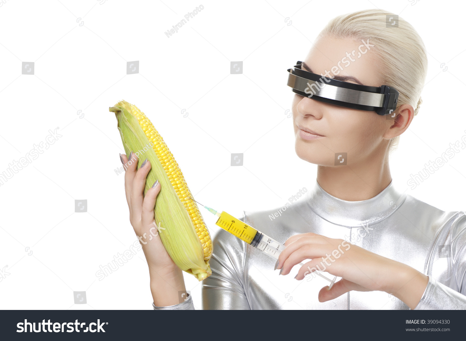
Andjress Pidjass, the photographer behind that “Cyber Woman With Corn” series (yes, it’s a series) earned about $200 off of one image, he told Pixsy. Never mind the residual benefits of stock photo stardom – it’s infamous on Reddit’s r/wtfstockphotos, and there’s a dance-rock album named after it. “Not bad for such a weird concept,” he said.
Dennis O’Clair, the artist of “Nun underwater” fame, earned over $12,000 from the shot, though he can’t quite remember what he was trying to get across with the photo.
Weird stock photography is a viable side-business for photographer Tracy King, the mastermind responsible for a series depicting a topless Santa pinching his own nipples. Every now and then he checks in on his creations, he told Buzzfeed News. “It’s funny finding these images and the stories people use them for, or the memes that people generate using my images.”
Indeed, some do become viral memes. Look no further than the story of Hide the Pain Harold, or this compilation of women laughing alone with salad.
You can join the almost 350,000 people following @darkstockphotos on Twitter, or become one of 190,000 subscribers to r/wtfstockphotos on Reddit.
Though their uses might be limited, there’s no denying their popularity is not.
Picking that perfect photo
As hilarious as some of these photos are, when you’re picking the perfect stock image for your website, billboard, or video, better stick to these guidelines:

Start with feelings. Think about the emotions you want to elicit, then plan how your imagery will help you get there. That means setting standards for things like the kind of action you want to show (if any), the contrast and saturation of the shot, the subject of the image (e.g. people, objects, animals, nature, etc.), how metaphorical or abstract you want to get, and the distance, angles, and cropping you want to use. Stick to the plan for consistency across all your content.
Support your message. Pick a photo that has an immediate and obvious connection to the subject matter in your post, article, website, or video – whatever you’re creating. Make sure it’s relevant, too. For an article about comfortable retirement travel, maybe don’t use that image of a young couple backpacking up Machu Picchu, for example.
Think authenticity. We’ve seen millions of images of smiling business people in suits, smiling at the camera with their arms crossed in a can-do, let’s-get-em sort of way. And we tend to ignore them because they’re obviously posed and fake. Look for images that show a slice of real life that we can relate to instead.
Grab attention without distracting. It’s a fine balance between “Hey, look at me” and “HEY LOOK AT MEEEEE!” If the photo is controversial, widely used, too obscure, difficult to understand, overly loud, or a meme, your audience will spend more time pondering the image than reading your lovingly written words.
Withstand the test of time. Pop culture references are trendy, and might resonate with your audience today. That’s also their downfall. They age quickly, and rely on source material about which people can change their opinions even faster.
Match your colours. The photo you choose won’t exist in a vacuum. It’ll display alongside your logo, framed in your website, beside other design elements you use, so make sure nothing clashes or creates dissonance.
Leave room. If you’re overlaying text on top of your photo, make sure there’s room to place it without interfering with the framing or layout of the image. Generally, you’ll want an image with the main subject off to one side, leaving enough dead space for your addition.
Make sure it’ll fit. If you’re splashing a photo across the top of your website as a banner image, you’ll need to think about how your selection will look once you lop a little off the top and bottom. If you’re working with an Instagram post, what will it look like as a square? You don’t want to lose any important visual information when you crop it.
But hey, if “Cyber woman taking a vitamins from corn” fits the bill – and apparently for some, it has – go for it!